In early September 2012, Sprout Creek Farm sought out Ashworth Creative to design a new logo that would embody a more established look for the company. Immediately on board, the Ashworth team next took a tour of their peaceful sanctuary to get a better idea of the new client. The next few months of our journey proved to be some of the most enjoyable we’ve had yet.
Let us give you a better look at Sprout Creek Farm: Diversified. Peaceful. Rich. These are just a few of the words that would describe the essence of the farm. Nestled on 200 acres in LaGrange of beautiful Dutchess County, New York, Sprout Creek is a bountiful landscape that exists, mainly, to serve its surrounding community. Operating as an agricultural steward of the land, a creamery, a retail market and an education center for youth, their mission involves connecting the land, the animals and people — building harmony on a local level. It is not hard to see why we immediately fell in love with this project, and more so, Sprout Creek Farm.
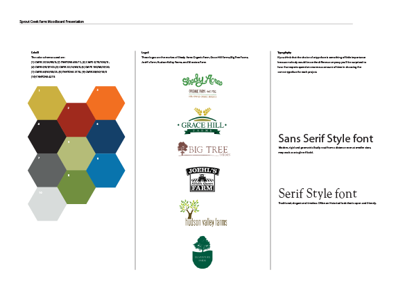
The first step was to head down to Sprout Creek to present a set of mood boards. The idea of a mood board is to solidify both a client’s style as well as the goals of a project. By presenting logos of similar industries, we can get a feel for what the client is thinking — what they like, what they don’t and what they envision for themselves.
Shortly after, it was time for a tour! The owner of Sprout Creek Farm, Margo, was gracious enough to lead us through each and every process. Staff often say, “right here we can watch the grass become milk that in-turn becomes the cheese enjoyed at our table and yours.” One of Ashworth’s graphic designers, Auden, mentioned how fascinating the tour was. “This was one of the most fun and enjoyable projects I’ve done thus far. The tour was such a great inspiration process for the logos I would soon design.”
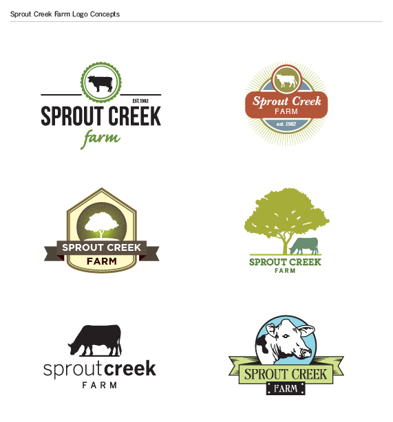
Once off the farm and back at Ashworth headquarters, graphic designers Isaac and Auden dove right into the creation of nine logo concepts. Each encompassed a rather novel feel — vintage, warm, inviting and just as colorful as every blade of grass on their pastures.
Below are a few of the concepts presented to Sprout Creek.
Upon completion of these concepts, it was back to the farm to present to Margo! In love with almost every one, she finally selected a winner. Satisfied with her choice, she asked Ashworth to make a few revisions: add an element of movement and include a sense of “ruggedness.”
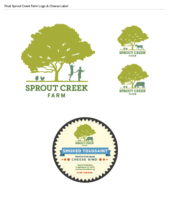
After a few slight modifications and creative handiwork, voilà, Sprout Creek Farm had a fresh, new logo — a logo that proved to be so them.

As always, we are both extremely proud of our work and very grateful for all of our clients. We would like to specially thank Sprout Creek Farm for creating such a pleasant experience. We most certainly look forward to our future projects with one another.


